Guest article
'It’s a bold new colorful world!' New beverage brands are leveraging colorful brand palettes
Take a walk through the soda aisle in any grocery store and you’ll notice one iconic brand after another that stop consumers with recognizable walls of red, blue, and green products. The cola wars could interchangeably be referred to as the color wars.
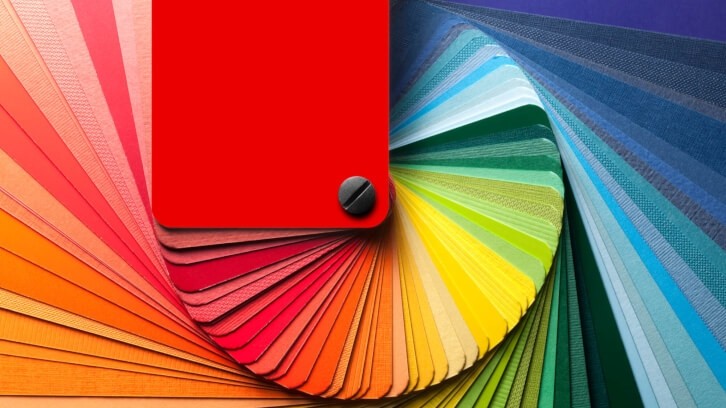
But new beverage brands are moving away from the traditional practice of owning one strong, brand-blocking equity color, and are instead leveraging colorful brand palettes that celebrate the variety within their product portfolios. With the move to so many colorful flavor cues, though, how can any one brand be recognizable, findable, and distinct?
A curated palette
Historically brands would launch a core offering and then extend to other flavors. The typical design approach was to maintain a majority of the design elements of the core product for recognizability and add a varietal color that is chosen to clearly communicate the new flavor. For example, adding a red bar for strawberry flavor and perhaps a small fruit image for clarity.
But take a look at Recess, the sparkling water infused with hemp and adaptogens that claims to deliver calmness and clarity. With such distinct functional benefits, a uniquely calm and cool color palette does the job of capturing the subdued mood. Soft pastel pinks, lavenders, and peaches marry perfectly with the messaging of “calm, cool, collected.” As a portfolio it is unique and memorable in its utter quietness.
for your 9–5, or your 5–9, Recess helps make everything a bit more calm, cool, collected pic.twitter.com/Q8TW7OJB6k
— Recess (@takearecess) April 3, 2023
In a similar vein, newer sparkling beverage Moment uses a palette of pastels but displays three to four colors for each flavor, swirling them together in a dream-like haze that reflects their message of “drinking your meditation.”
These colorful palettes are not limited to Gen-Z-appealing pastels. Vibrant hues with liberal use of shades that pop perfectly convey the joy and energy of Del Monte’s Joyba bubble teas. And Swoon’s candy-colored world is a clever cue to consumers who wish to have the experience of enjoying fun flavors but prefer to steer clear of all the sugar that accompanies traditional confections. Both of these delightful brands use multiple colors to differentiate each SKU versus the usual approach of using a single varietal color.
When developing a curated color palette, it is essential to begin by identifying the desired sensorial experience you wish the brand to deliver. Sensory principles guide the brand in creating intentional design elements that build an emotional connection between the brand and consumer. A well-defined color strategy impacts a brand beyond the packaging – a colorful brand world leveraged in all channels and touchpoints builds even more recognizability and loyalty.
Equity in iconic design elements
No matter how distinct a color palette, there is a real risk of losing brand stopping and blocking potential when the entire category is full of colorful portfolios. It is important to take a hard look at all the brand’s design equities – the brandmark, type, illustration, and pack architecture – and measure each for impact and distinctiveness.
Antioxidant sparkling water Bubbl’r is both colorful and highly interruptive in a rapidly growing category. The brand uses unique jerky linework in its very prominent custom type as well as in the flavorful fruit illustration and in the edges of color fields. Despite even the brandmark changing color per flavor, Bubbl’r is easily recognized. This Gen Z favorite describes itself as “water’s bubblier and more energetic best friend.” This claim smartly gives the brand permission to play outside the rules of typical water design cues.
Natural flavor ✅ 0g sugar ✅ no artificial sweeteners ✅ natural caffeine ✅ rizz ✅ ✨ pic.twitter.com/eGNepJtTBD
— BUBBL'R (@drinkbubblr) April 19, 2023
While there are many smaller, emerging brands that are prime examples of colorful variety, there are steps that larger heritage brands can take to ensure relevancy in a rapidly changing category. Key questions should be asked in analysis of any brands’ current design strategy:
- Is our brands’ current color story doing the job of conveying our promise, our product, and our point of difference?
- What is our holistic portfolio color strategy? Is there a vision for the brand or have individual products driven these choices?
- Are we taking emerging consumers’ desire for flavor exploration into consideration and providing a visual experience that celebrates the diversity of our portfolio?
Whether it means taking evolutionary steps to introduce more varietal color or leaping in with flavor takeover strategies, brands that serve up colorful, sensorial cues will meet consumers’ desire to have not just a beverage but an experience.
About the author: As Director of Design Strategy at CBX, Amy draws on more than 20 years of branding experience in a variety of creative, strategic, and innovation roles in the Chicago, Minneapolis, and Kansas City markets.

Her prior experience as a Creative Director and designer enables her to seamlessly connect consumer insights and cultural inputs to strategic opportunities and creative expressions.
She has developed emotionally resonant brands that fit very real needs in our everyday lives for clients such as General Mills, Conagra, Nestlé, Purina, Procter & Gamble, and PepsiCo.
Amy holds a B.F.A. in Design from the University of Kansas. When she’s not cheering on her daughters on the soccer field, she longs to be enjoying a good book on a sunny beach.