Enter the dragon: Asahi Super Dry on the importance of ‘relatable’ packaging in Asian markets

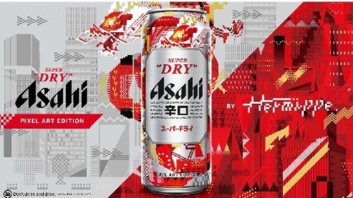
Asahi’s keystone international premium beer Asahi Super Dry launched pixel-inspired, dragon-themed cans in conjunction with the lunar Year of the Dragon in various key markets in Asia.
Regional Head of Brand Mag Lai told us that the modern pixel element was a crucial combination with the traditional dragon symbolism in order to engage consumers more deeply.
“In APAC overall, we’re definitely seeing that packaging is becoming a form of product innovation and differentiation [and there is] an increased focused on incorporating digitalisation into beverages packaging,” she told FoodNavigator-Asia.
“That said, we also understand at Asahi Super Dry that having packaging that stands out on the shelf is no longer enough – it must convey an engaging narrative that appeals to consumers and fits with their values.”
Pixel art is closely linked with the development of games and is symbolic of Japan’s 1970’s videogame culture, prompting the brand to utilise this to convey the dragon as a traditional zodiac symbol.
“This is why we collaborated with Japanese pixel artist Hermippe to develop our limited edition Pixel Art cans – [we see that] Pixel Art has now transcended the confines of traditional gaming, and evolved to become a modern means of expression crossing the boundary between real and digital worlds,” she added.
“[The idea is for] the complex artistic illustration of the pixel dragon on our cans to inspire and excite consumers about the festivities and the new year [alongside] the quick peak and clean finish that comes with the taste of Super Dry.”
Asahi launched limited edition cans solely in Asian markets such as Hong Kong, Mainland China, Taiwan, and Singapore, all of which celebrate the Lunar New Year as a major traditional and cultural festival.
“[This introduction of Pixel Art is part of] Asahi Super Dry’s continuous search for innovative ways to engage with consumers,” Asahi Beer Asia’s Marketing Director Loretta Lee added.
“The Lunar New Year is traditionally cherished for fostering bonds with family and loved ones, [and we are making the most of] this opportunity by evoking a sense of modernity by reimagining the festival through pixel art.
“We hope this has brought a a modern yet familiar experience to consumers [in the] Asia Pacific region.”
The limited-edition Pixel Art Asahi Super Dry cans are still available in supermarkets, online and select foodservice outlets across the APAC region.
Relatable to both brand and consumer
In addition of being relatable to consumers, the firm also stressed that there can be no doubt about the importance of enabling consumers to relate the products back to the brand as well.
As such, in addition to utilising pixellation to create a link to gaming and digitalisation, the pixel dragon in question was also designed to reflect Tokyo and depict a futuristic Tokyo cityscape – a key link back to Asahi birthplace Japan; and the red colouration most frequently associated with Lunar New Year was also fused with silver – the colour of the Asahi Super Dry cans.
“The idea is that Asahi Super Dry is unleashing the dragon’s potential and breathing fiery new life into a once predictable festival motif,” Lee said.


