Modern identity
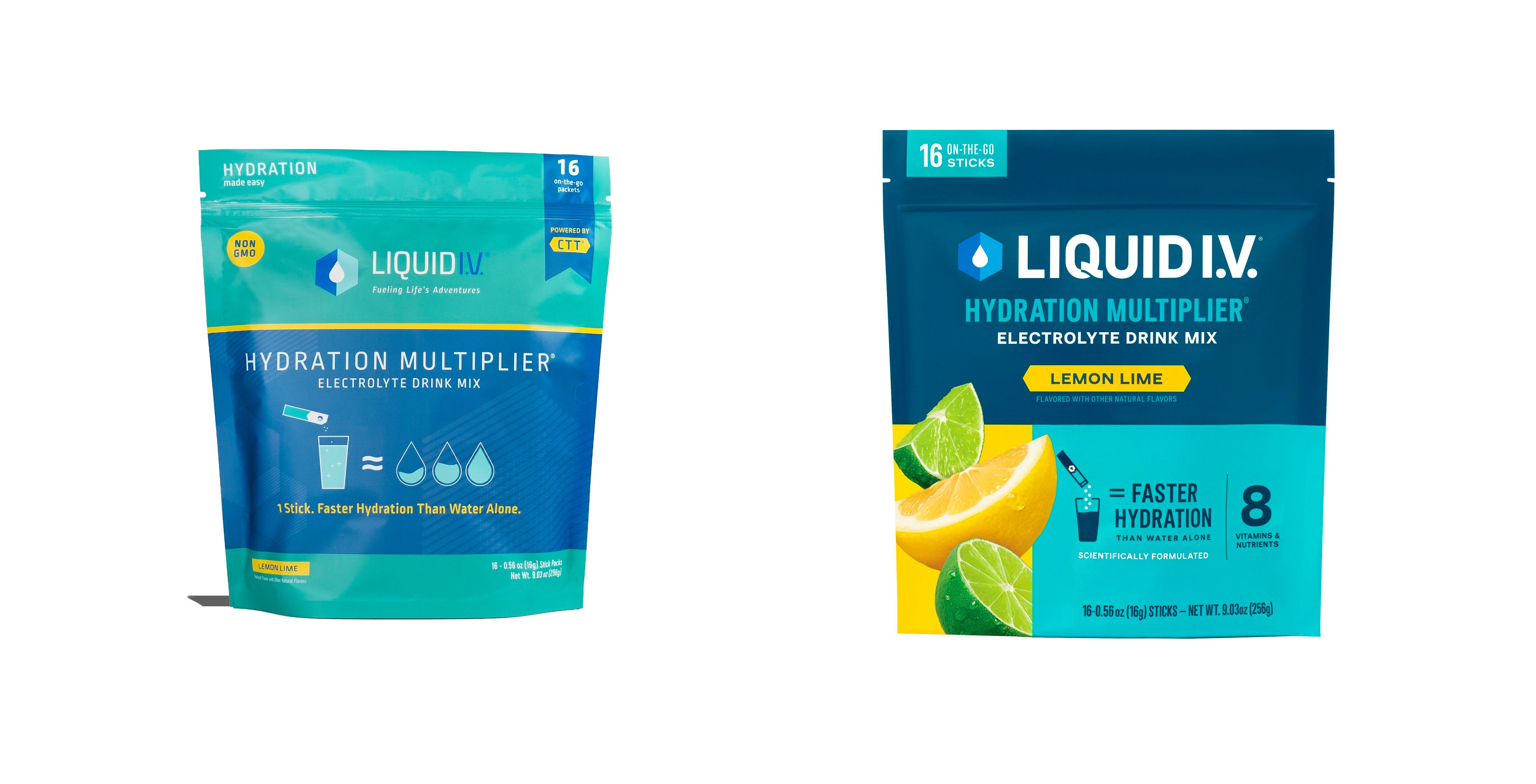
Liquid I.V. has gone from strength to strength – it's now the top powdered hydration brand in America and is expanding globally. But it hadn't refreshed its look since it launched in 2012, nor since it was acquired in 2020 by Unilever.
Now, a rebrand brings with it a modern visual identity and color palette with customer-inspired, benefits-driven packaging and merchandising.
The reimagined branding places the customer experience at the forefront with new packaging and merchandising strategies that spotlight the brand’s functional benefits and ever-expanding selection of delicious flavors.
The new look and feel includes an updated version of Liquid I.V.’s iconic two-toned hex logo with a modernized color scheme and bolder typeface that underscores the impressive brand equity that’s been built over the last decade. The new packaging is also designed to enhance the brand’s presence in-stores with images of the true-to-fruit flavors and a renewed emphasis on the nutritional benefits and superior hydration solutions found inside.
“Launching this brand refresh marks a watershed moment in Liquid I.V.’s evolution and kicks off the next chapter of growth and innovation for our company,” said Liquid I.V.’s CEO, Mike Keech. “The new look and feel reflects our passion to help everyone live healthier, more fulfilling lives through our innovative solutions that turn ordinary water into extraordinary hydration.”
The new look debuts alongside a brand campaign called ‘Tear. Pour. Live. More’.
Tradition meets modern design
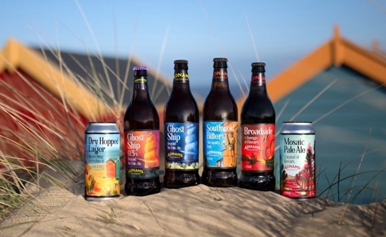
UK brewery Adnams celebrated its 150th birthday in 2022, which encouraged the brewery to clearly define its vision for the future.
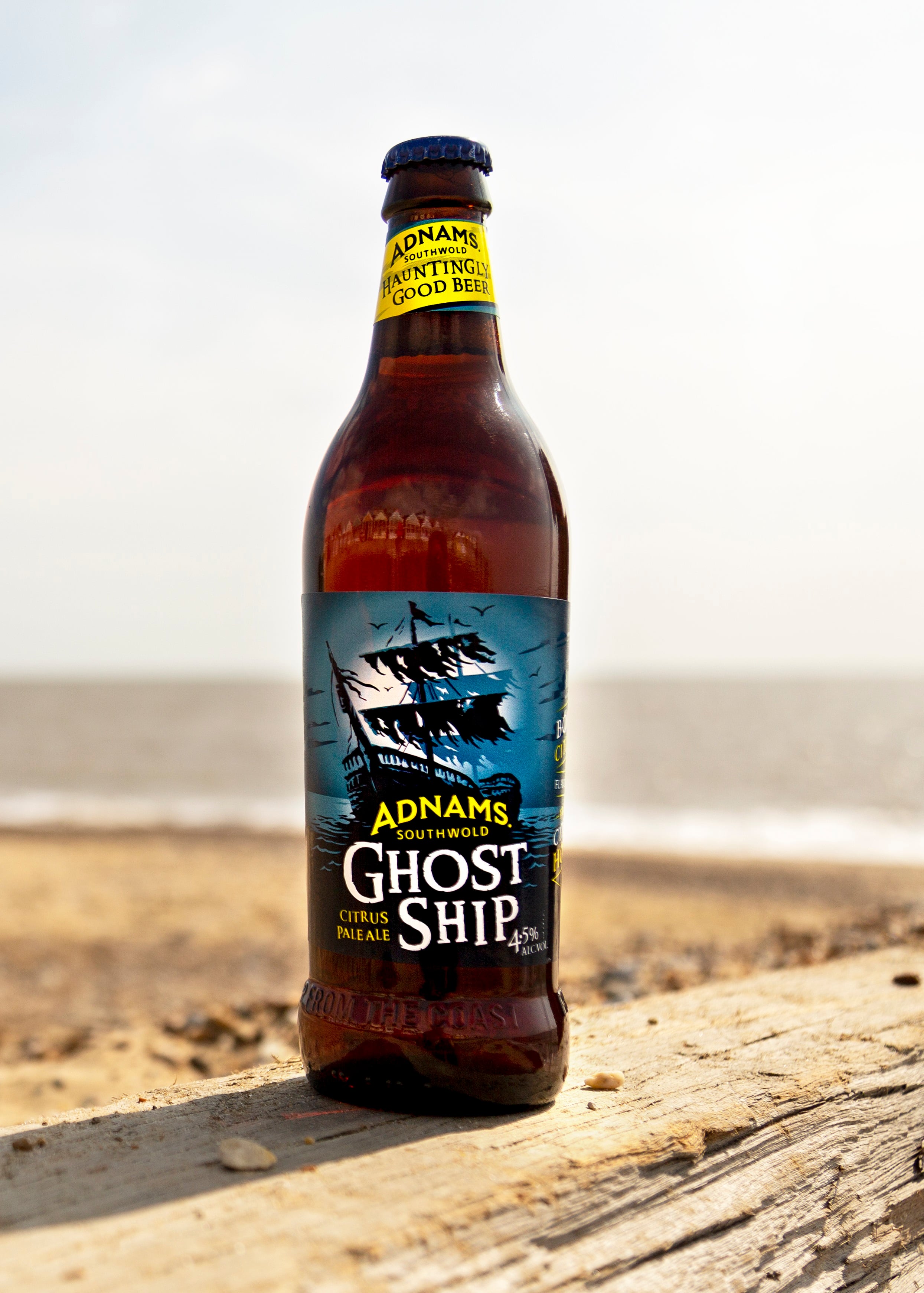
The range of coastal brews has been reimagined by Adnams and Brighton-based design studio CookChick with local artist Vanessa Sorboen, to reflect the brand’s Suffolk home.
Drawing inspiration from its coastal shorelines, and expansive horizons, the redesign illustrates the rich history in this pocket of England’s East coast.
Fergus Fitzgerald, Head of Production at Adnams said: “There are two main aims of the redesign. Firstly, it allows us to bring all our beers back under one unified look. Beers like Mosaic and Dry Hopped have been two of our core beers for a while and whilst having a different look made sense in the early days, bringing them together again reflects the fact that our brewers use the same great quality ingredients and the same skill and dedication when brewing a beer, regardless of whether the recipe comes from 1872 or from 2024.
“Secondly, the new branding really brings out that sense of place and connection to where these beers are made. The paintings tell the stories and showcase the beauty of the landscapes that inspired those beers.”
Ghost Ship 0.5% Pale Ale, the UK’s best-selling low and no ale in the on-trade, launched in December 2023 in the new design. The rest of the rebranded range is now rolling out, alongside two new brews: Big Skies, a Double Dry-Hopped IPA, and Deep Seas, a Belgian-style Blonde.
Jess Turner, Head of Brand and Creative at Adnams said: “If you looked at our beers on the shelf, it was starting to feel like a timeline of Adnams’ design. There was the need for some stronger brand recognition to help customers shop across the range and explore other Adnams beers. The project aimed to unify our range and bring them closer together - so they felt part of a clear Adnams family. There is a real sense of customer ownership across our beers, so it was important that we recognised that and maintained their individuality. These are fabulous beers with strong stories and we’re really proud of them.”
Premium look
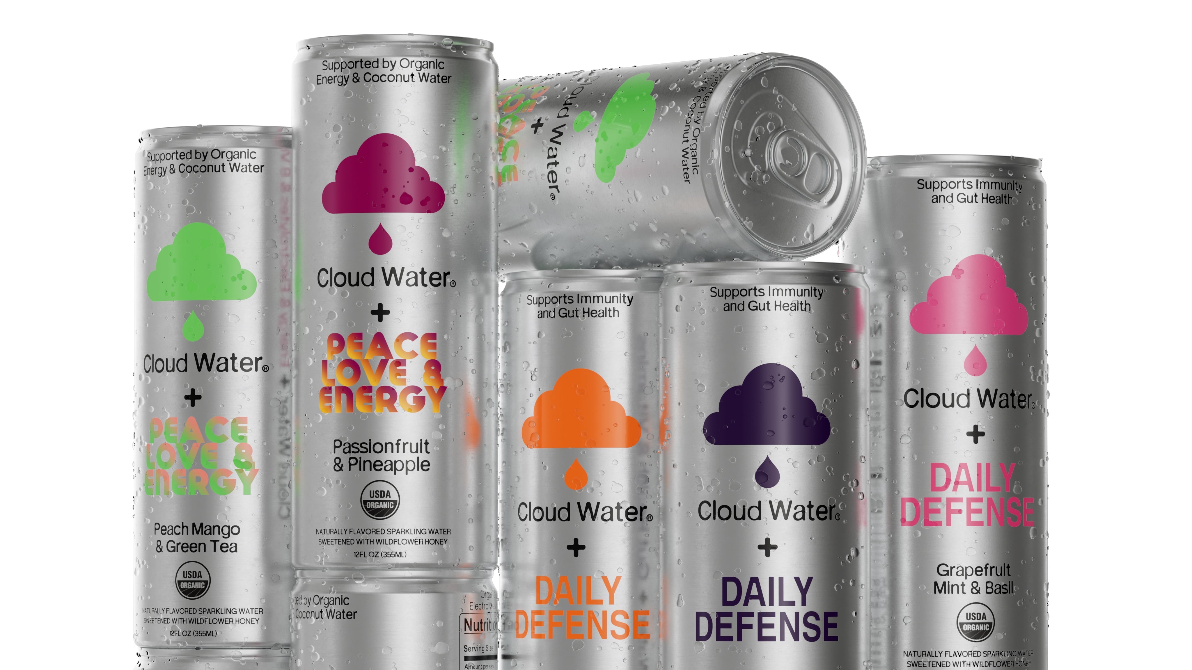
US brand Cloud Water debuted a new look at Expo West in March: partnering with design experts to elevate its image and better reflect the premium experience inside every can.
The rebrand comes back to Cloud Water's goal of creating a holistic approach to immunity, gut health, energy, and overall well-being.
This 360-degree philosophy shines through its sleek new silver cans and packaging that better highlights their high-quality ingredients as well as its new thoughtfully crafted formulas.
Spotting an opportunity
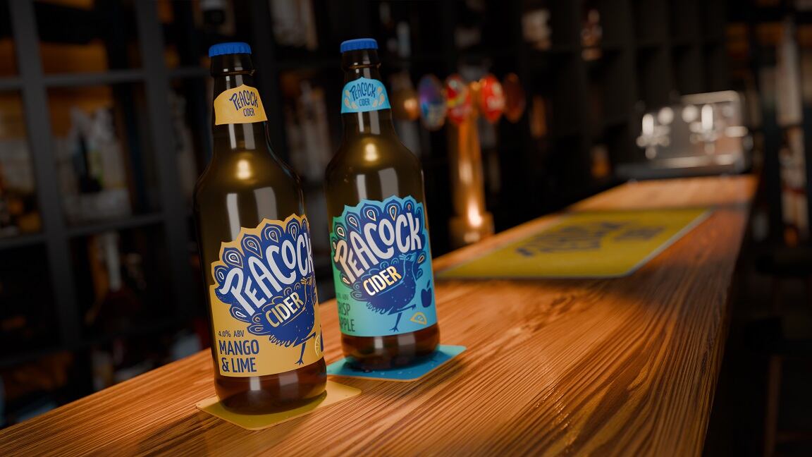
For premium beer and cider company Kingfisher Drinks, rebranding the Peacock cider brand is about making the most of an untapped opportunity in the UK market.
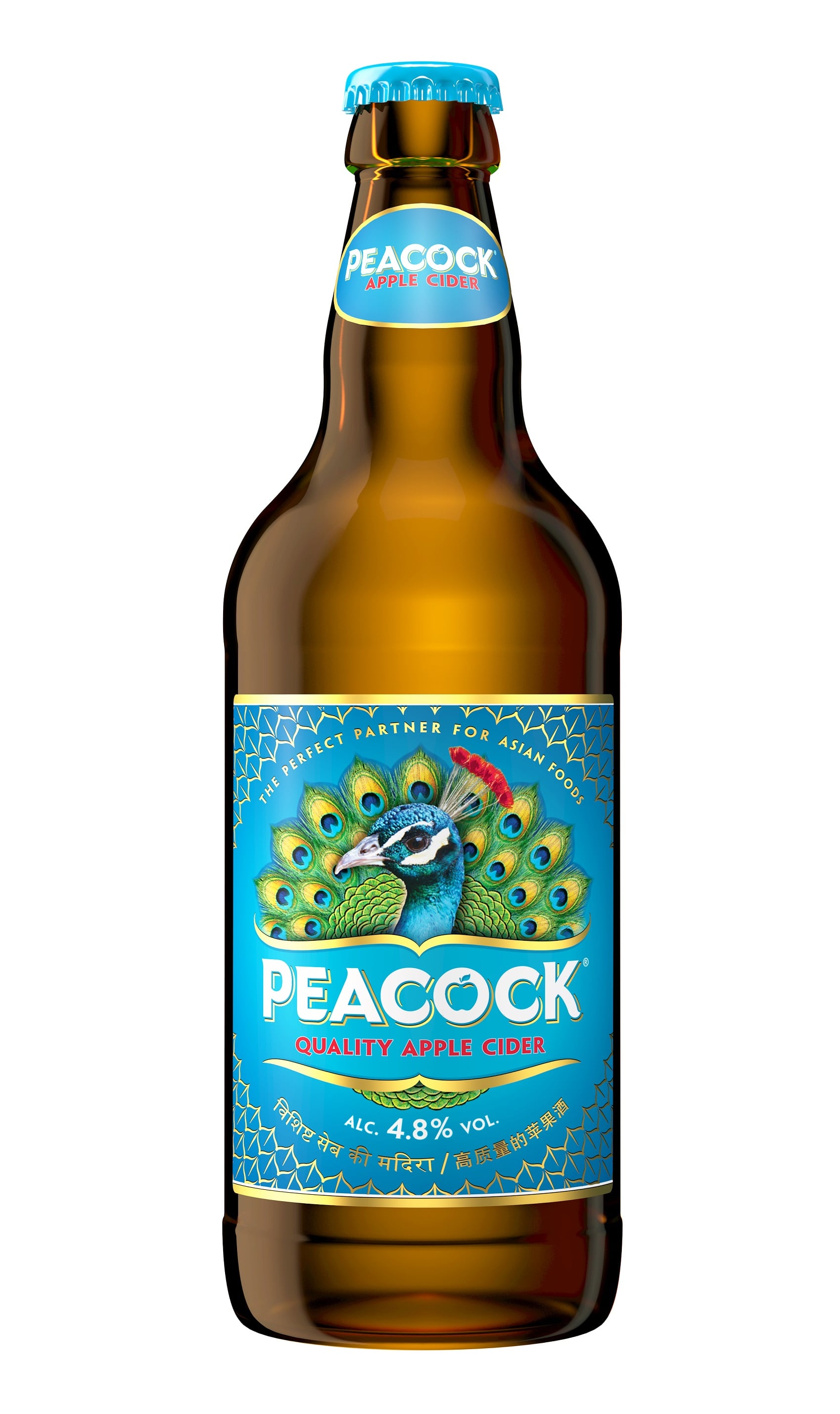
The rebrand was, in part, led by a desire to modernize the brand’s look and feel, as well as further aligning it with the company’s wider premium portfolio. But there’s more to it than that.
With flavored cider trends seeing consumers increasingly shift towards packaged products over draught, the brand wanted to up its game and inject some additional character to the brand with a new take on the peacock bird to appeal to make the most of this trend (in fact, sales of packaging and draught cider in the on-trade are now fairly evenly matched).
In addition, food pairing is still very important to cider drinking occasions too, with 73.6% of off-trade serves being with food and 46.9% of on-trade serves.
Tell the brand story
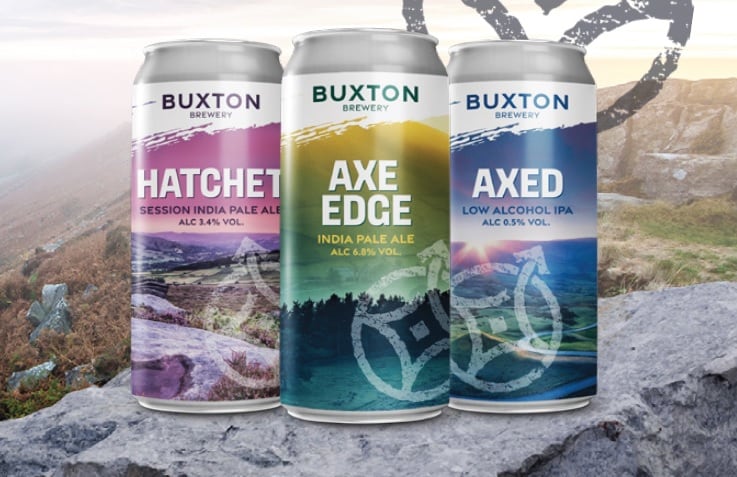
Buxton Brewery – a brewery in the UK’s Peak District national park – knows its brand story resonates with consumers. So its rebrand emphasizes local imagery and ideas.
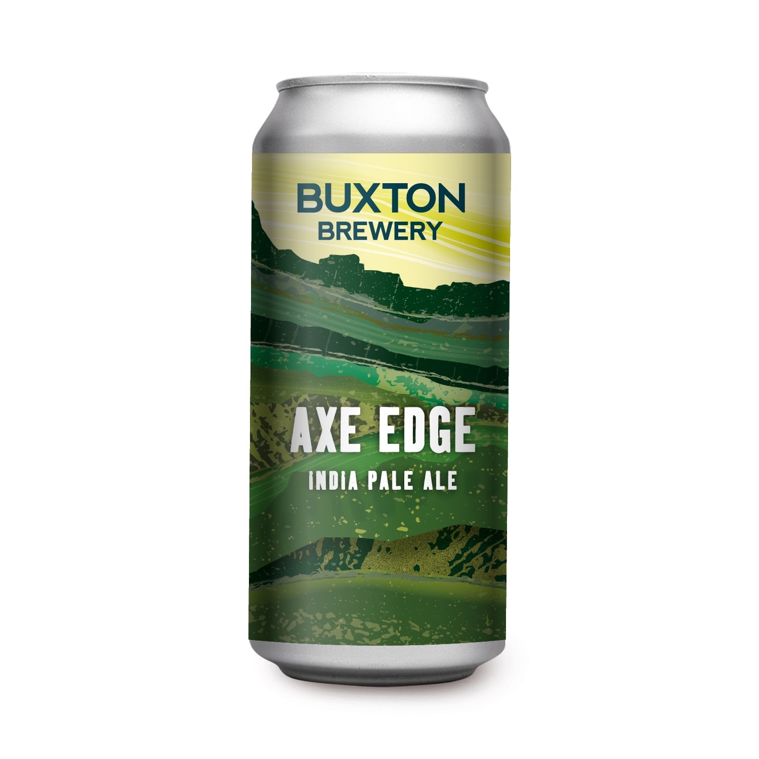
Rather than sit down in an office to discuss ideas on paper, the brewery released the designers 'into the wild' of the Peak District, who returned with a new compass-inspired graphic that’s a nod to both that exploring mindset and the brand’s own adventurous approach to brewing. That is accompanied by a new logo font that’s ‘unmistakeably Brixton Brewery’ but with a fresh cut.
Imagery was drawn from local photographer Phil Sproson’s moody Peak District landscapes to bring some of the 'dark mysterious vibe' to the cans.
The flagship brew name Axe Edge remains unchanged, but others have been renamed to follow in its foosteps.
“Our rebrand began with our central story, because, like every great explorer, all great brands have a great story to tell,” explained Dominic Metcalfe, managing director, Buxton Brewery. “We know our customers share an adventurous, outdoorsy mindset with us, love our unique location in the Peak District and have an equally adventurous approach to trying new beers. This inspired our new narrative.”
A Proper Job
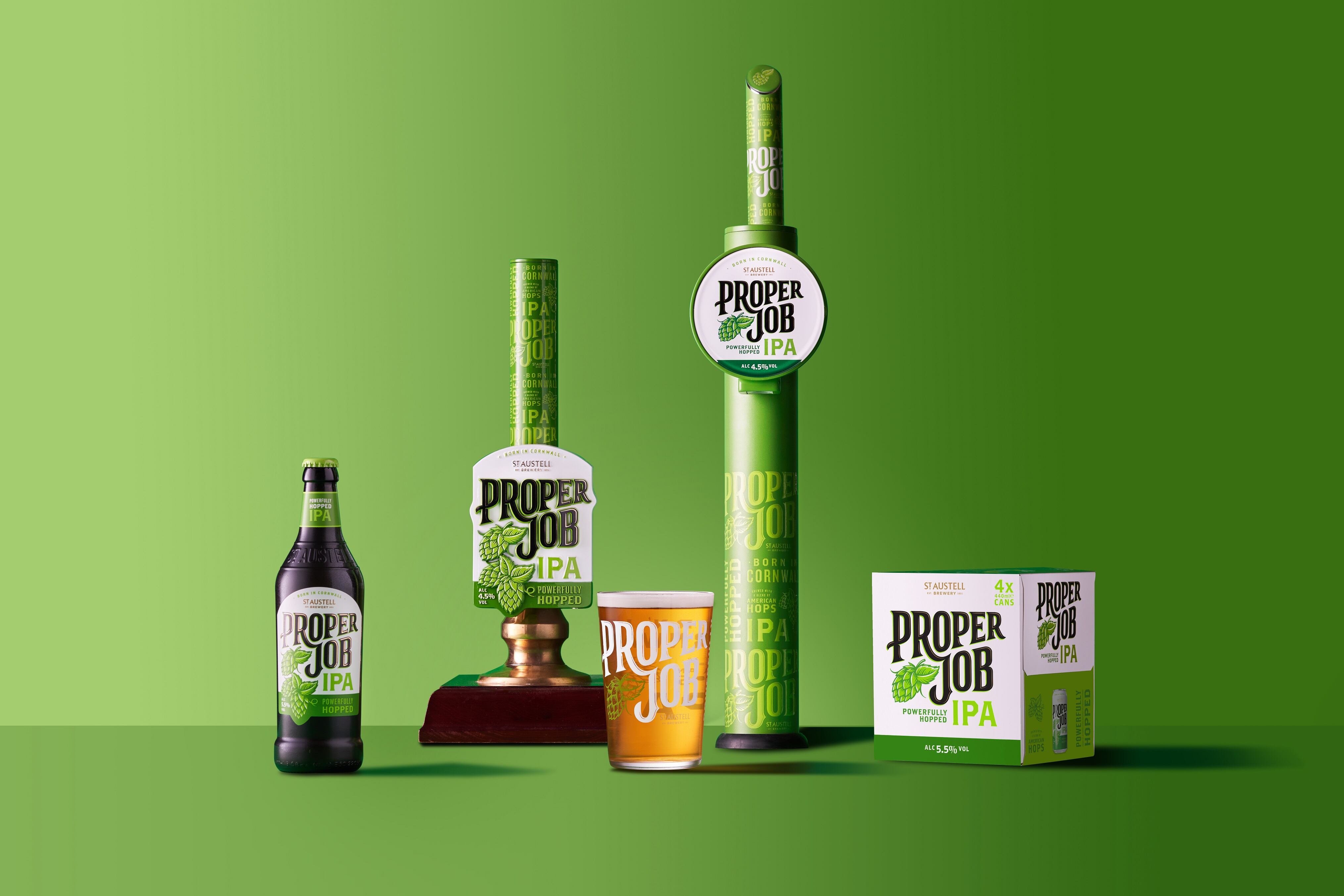
St Austell Brewery has unveiled a new look for its flagship IPA, Proper Job.
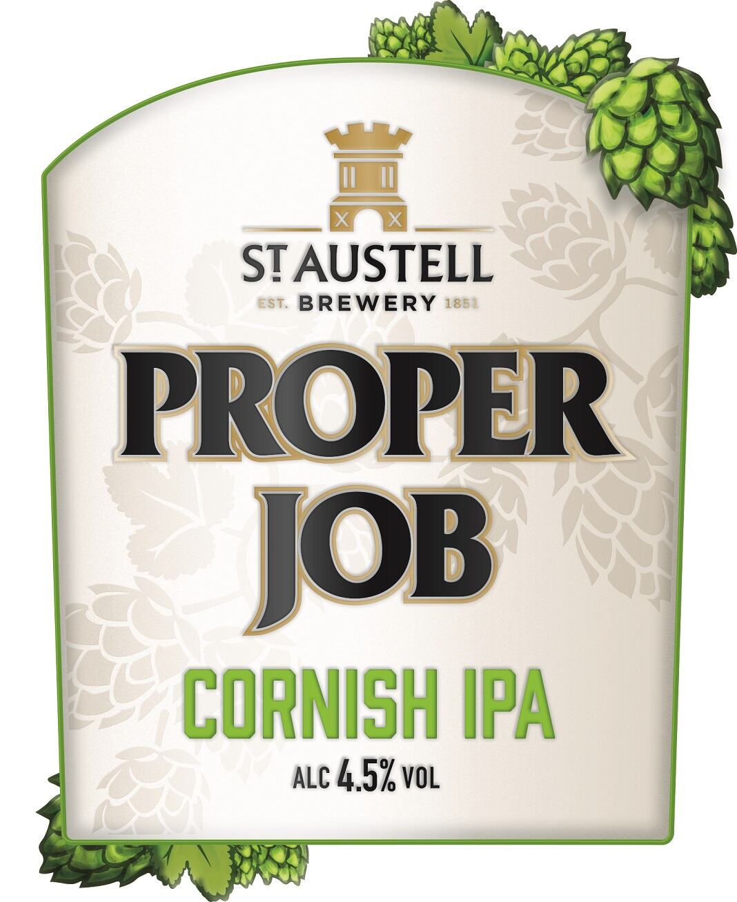
The inspiration behind the rebrand was to fuse heritage and heartfelt craft with relevance for today’s market. It features a striking new typeface and Proper Job’s iconic green is more prominent to maximize stand out.
A completely new brand world will be rolled out. This includes new glassware and pump clips in pubs, as well as new look bottles and can packs in supermarkets. The rebrand is being supported with a multi-channel marketing campaign.
Laura McKay, St Austell Brewery’s Marketing & Communications Director, said: “Since the brand launched in 2006 the beer category has changed significantly, and it had been a little while since Proper Job’s look had evolved. Proper Job is a famous Cornish phrase meaning ‘a job well done’. Just like its name, we’ve spent over a year perfecting the beer’s new look and testing it with beer drinkers and fans of the brand. Our investment in the brand is all about honoring Proper Job’s loyal drinkers with a design that doesn’t stray too far from its roots, as well as reaching new audiences with its fresh look and feel. There’s absolutely no change to the much-loved IPA’s recipe.”
Summer refresh
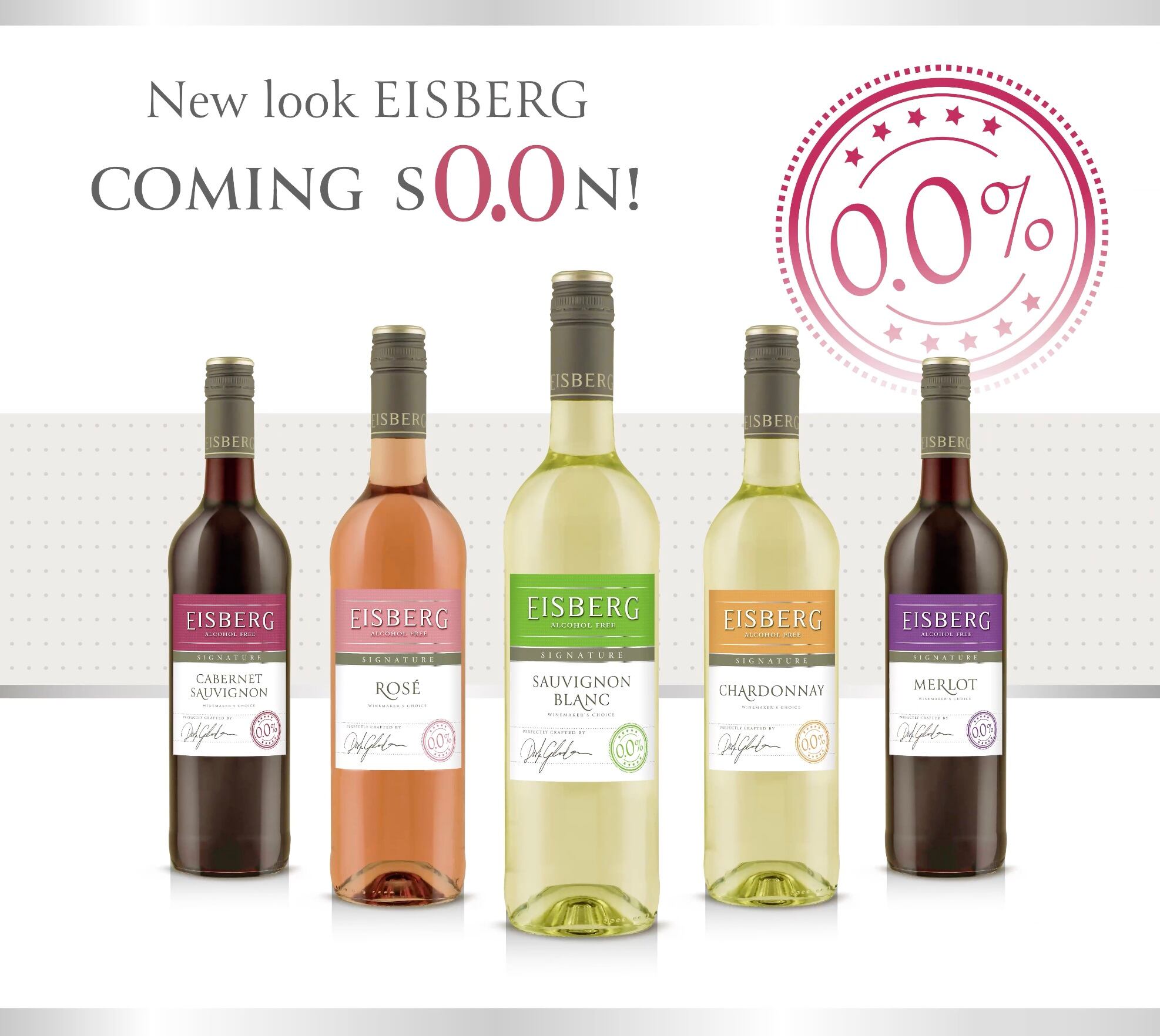
For German alcohol-free wine brand Eisberg, a rebrand is about breathing new life into the brand before the key summer months. It has rebranded its range with a new ‘Eisberg Signature’ line.
‘Eisberg Signature’, will be introduced alongside the new premium ‘Eisberg Selection’ line, marking the start of a new chapter for the brand.
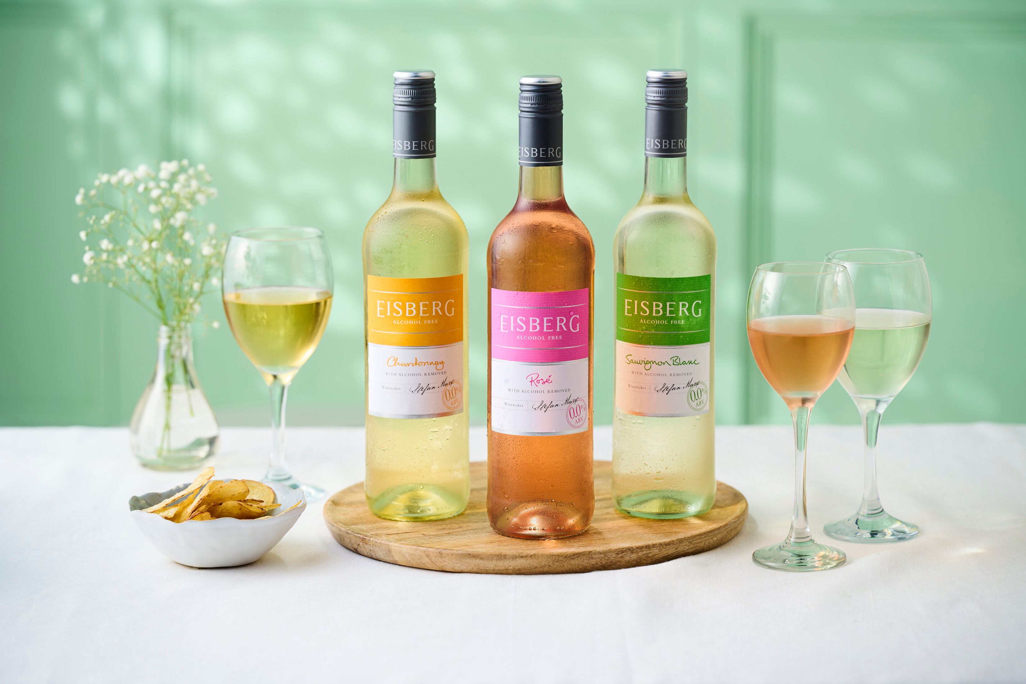
Dan Harwood, account manager at Eisberg Wine, explained: "The refreshed label on our beloved original range will give the brand a new perspective, showcasing our commitment to staying in tune with the evolving trends amongst the alcohol-free audience."
The soon-to-be-renamed Signature range, comprising Sparkling Blanc, Sparkling Rosé, Sauvignon Blanc, Chardonnay, Rosé, Merlot, and Cabernet Sauvignon, offers a diverse selection of wines for every palate at a very affordable price point. And the rebranding underscores Eisberg's overarching vision to cater to every customer for every social setting.
“While there's considerable interest in the premium 'Selection' range for special events or people who look for a more luxury bottle of wine as a weekend treat, customers will continue to rely on the 'Signature range' for their everyday needs” said Harwood.
Bold, confident elegance
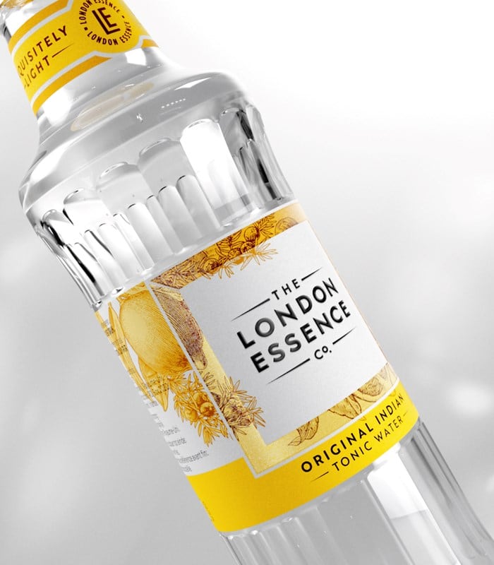
Britvic’s mixer brand, The London Essence Co., has refreshed its brand portfolio in collaboration with BrandOpus.
The new design features the classic brandmark framed in a confident white square, creating a label ‘that acts as a mark of exquisite taste and authority’.
At the heart of the redesign is the distinctive square frame, layered with bespoke botanical illustrations woven under and over it. It also features the LE monogram, designed into a pattern signifying a mark of quality that features on every product.
The design reflects the core of London Essence’s brand promise, with every drink crafted from delicate layering and artfully blended ingredients.
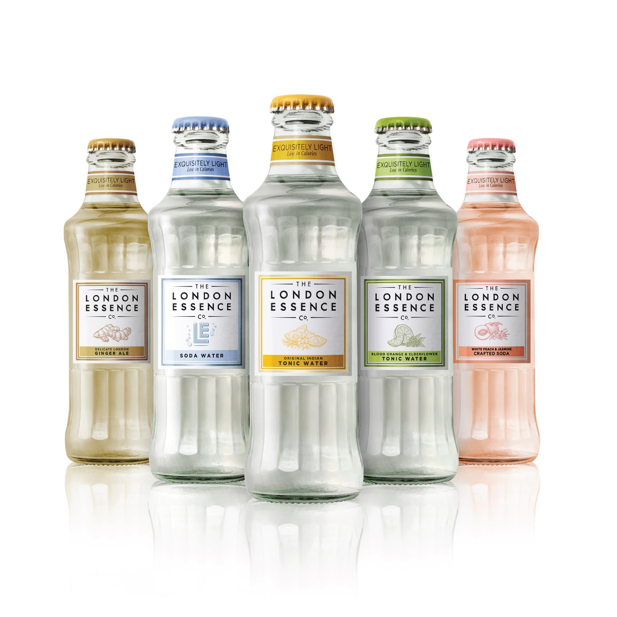
London Essence seeks to represent itself as a ‘Tastemaker’ by capturing the boldness and creativity of the city which bears its name within its packaging and recognising the brand’s heritage of supplying luxury fragrance houses.
Dan Wegrzyn, Business Director at BrandOpus said about the new design: “With this rebrand, we wanted London Essence to act and behave as a Tastemaker would, with more ways to tell its story and drive desire. With the team at London Essence, we’ve relished the challenge of standing-out in the category and appealing to a new generation of discerning drinkers with a more connected, more intentional and confident expression of the brand.”

